Problem Area
Due to the pandemic, most users switched to online payment methods to avoid contact through cash exchange. Online payment via phone apps like GPay, and Paytm made the whole transaction process smooth and convenient.
But it raised a new concern. Due to increased online transactions, people cannot track the cash outflow. During my college days, it was hard for me to track the cash outflow. It hit me when I used to see my bank balance at the end of the month and keep wondering where I spent all my money. My other friends were also facing the same issue.
Research
After evaluating the app among designers and talking to parents whose kids are using the jellow app, we realized the engagement of this app is pretty low, and it’s hard for them to remember the sentences for a longer time. Kids also have a short attention period, making it difficult for parents to make their kids sit and learn.
Contextual Inquiry
Armed with this vague idea of our product, we moved ahead to conduct a few interviews with people to understand the underlying problems through Contextual Inquiry.
We employed the Master/Apprentice approach to understand the system and people's concerns thoroughly, while we could easily gel in with them as partners to understand their points of view.
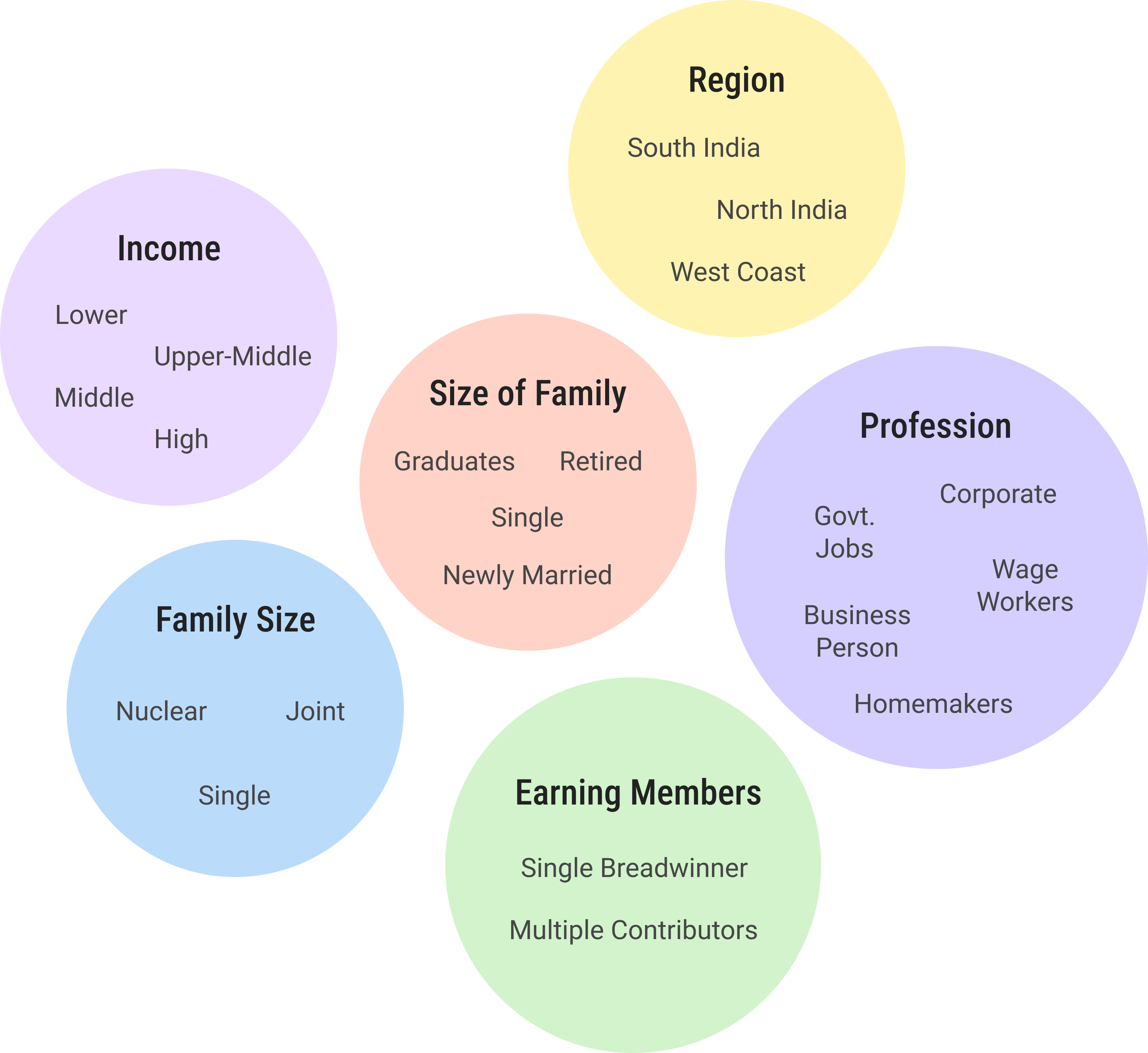
We conducted 19 interviews. Following is the spectrum of the variability of the people we interviewed:
Interpreting Interviews
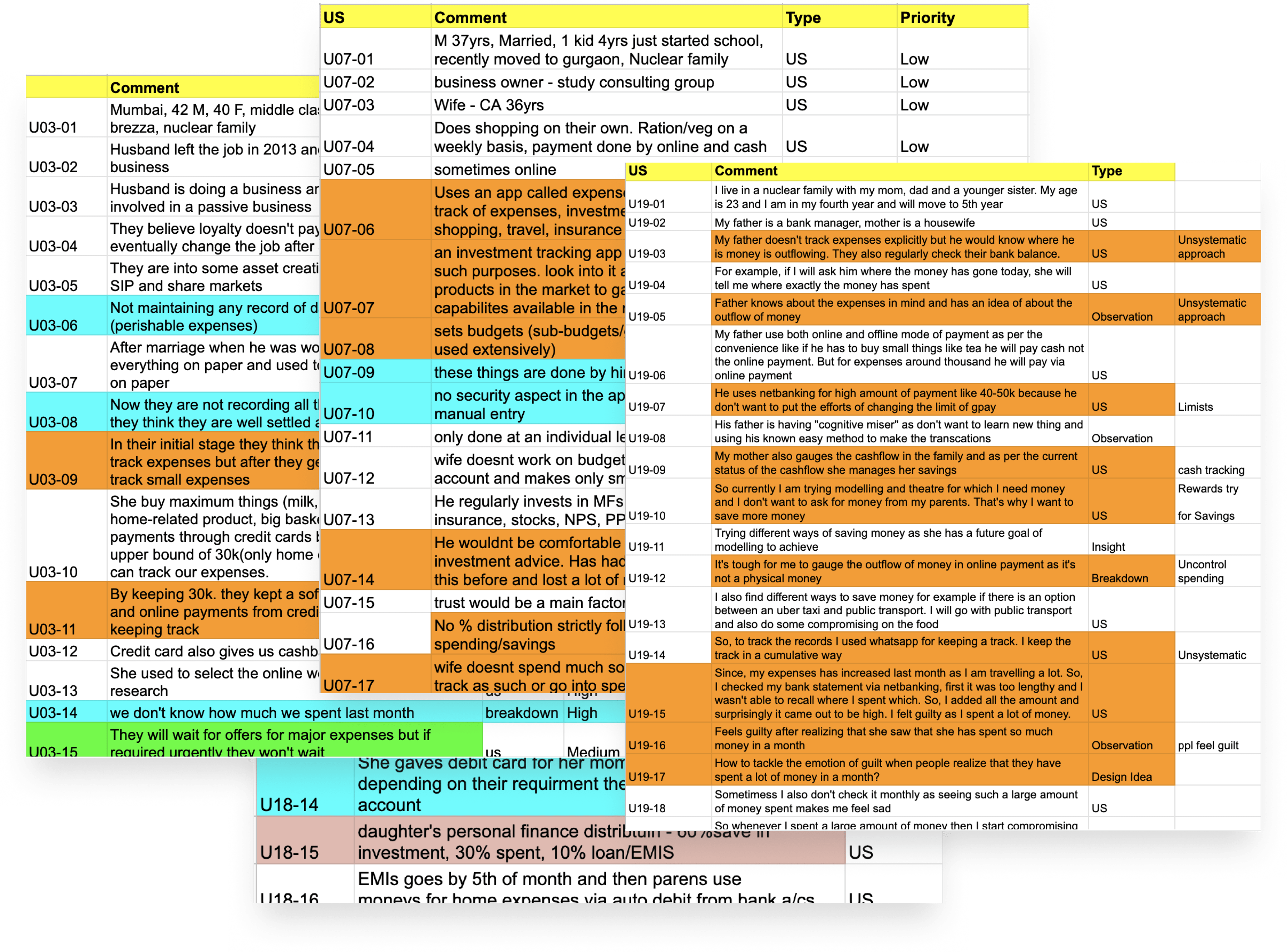
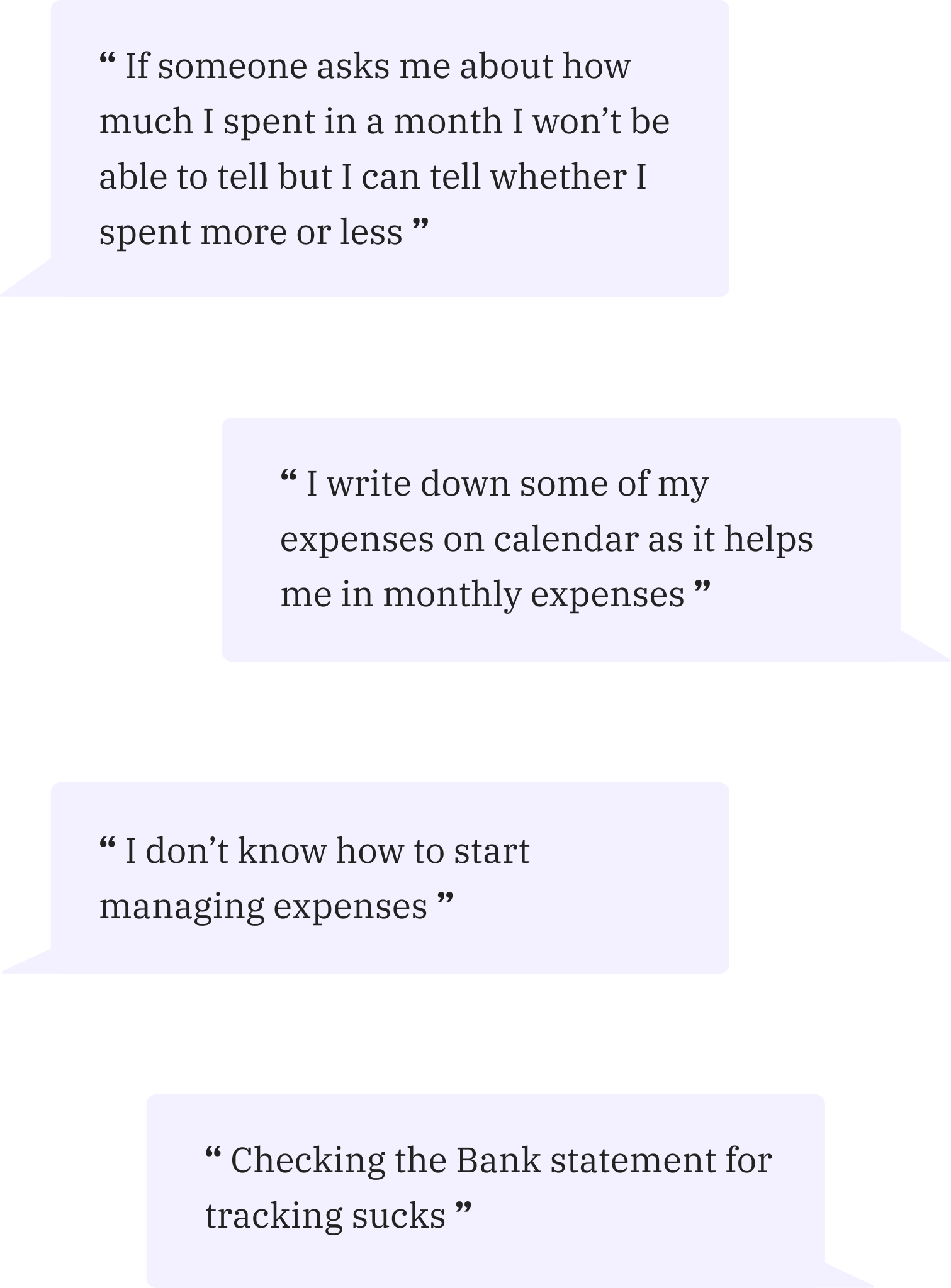
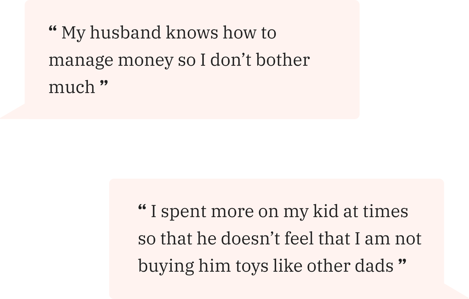
After conducting interviews, we interpreted them and classified them as User Statements, Observations, and Breakdowns to derive Insights and Design Ideas.
Work Models
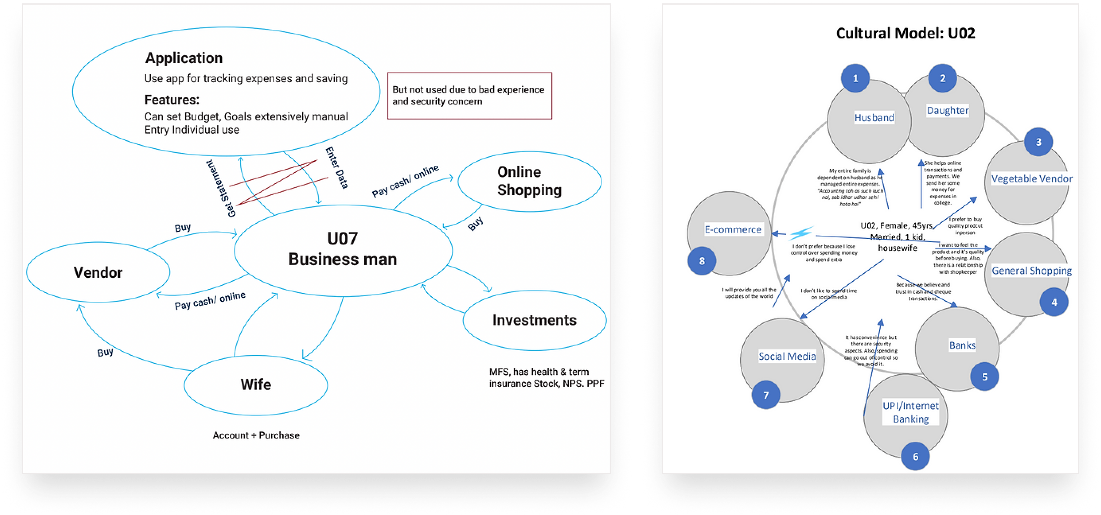
To understand the system better from the eyes of our primary users, we drew up quick work models. We were able to identify a few critical major breakdowns from the same.
Affinity Mapping
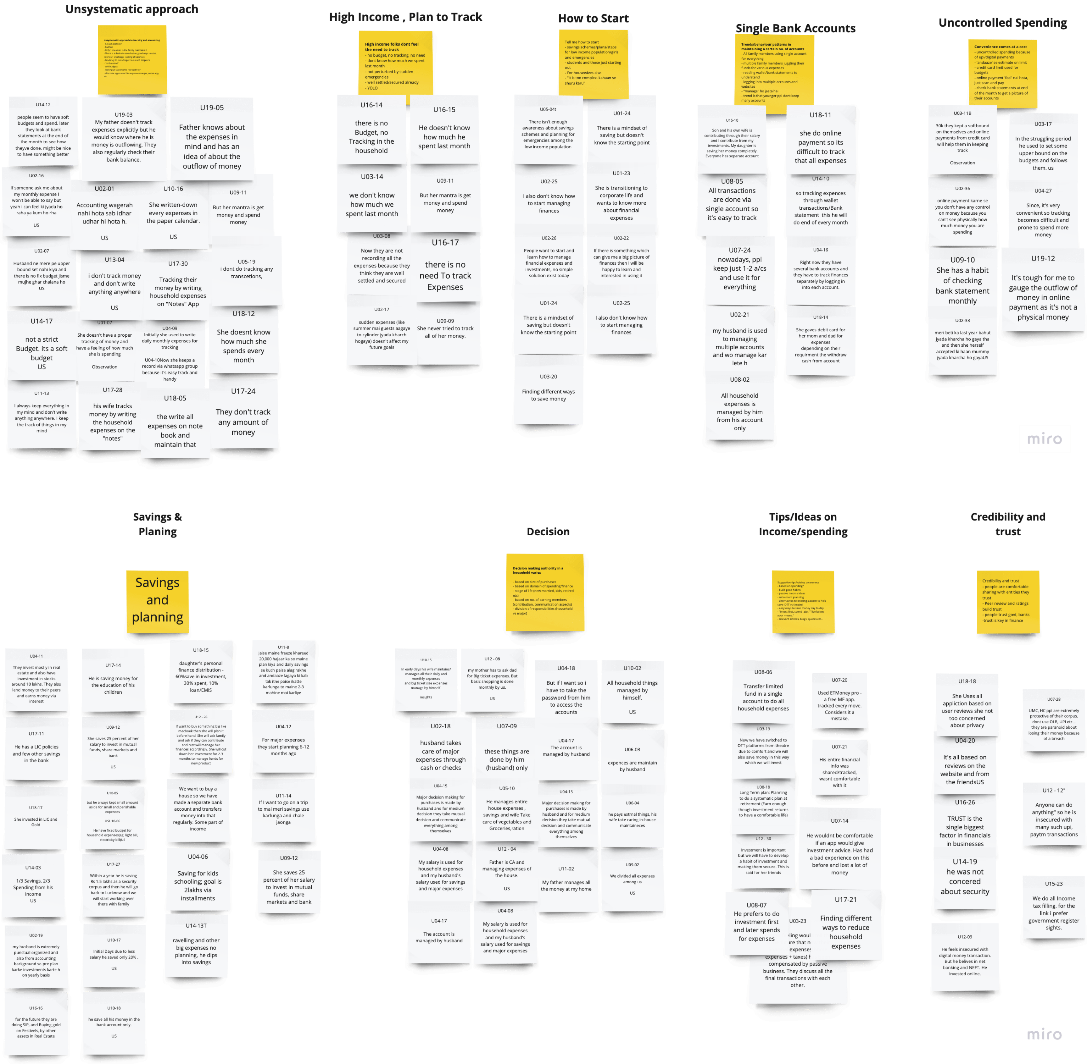
Then we continued the process by doing a bottom-up affinity mapping on a Virtual Whiteboard and were able to list detailed insights, significant breakdowns, and a few design ideas to try and tackle those issues.
Key Findings

People are following an unsystematic approach to tracking that, too, at the superficial level, not a granular one.

Some people are unaware of home accounting and want to learn about it but don't know how to start.

People are following an unsystematic approach to tracking that, too, at the superficial level, not a granular one.

They don't like sharing every detail of their expenses with family members.

Online payment is convenient, but it results in uncontrolled spending.

If one of the family members is aware of home accounting, other members tend to fall on them for personal financing.
Cultural Findings

People are following an unsystematic approach to tracking that, too, at the superficial level, not a granular one.

Some people are unaware of home accounting and want to learn about it but don't know how to start.

People are following an unsystematic approach to tracking that, too, at the superficial level, not a granular one.
Improving Opportunities
1
Making a centralized system to make the process of tracking seamless for everyone.
2
Helping them to align their expenses for planning and accomplishing future goals.
3
Building trust, credibility, and security within the application
4
Setting up a dashboard with the help of data visualization to present their expenses in different categories like accessories, food, and rent.
5
Using gamification and emotional triggers to educate users about the practices of personal financing.
Ideation
Now, we wanted to use the research outcomes to brainstorm many ideas. We put the design implications, personae, and goals on the board and discussed ideas individually. We then had a discussion and came up with more ideas to pursue. This helped us in creating low-fidelity wireframes.
Persona
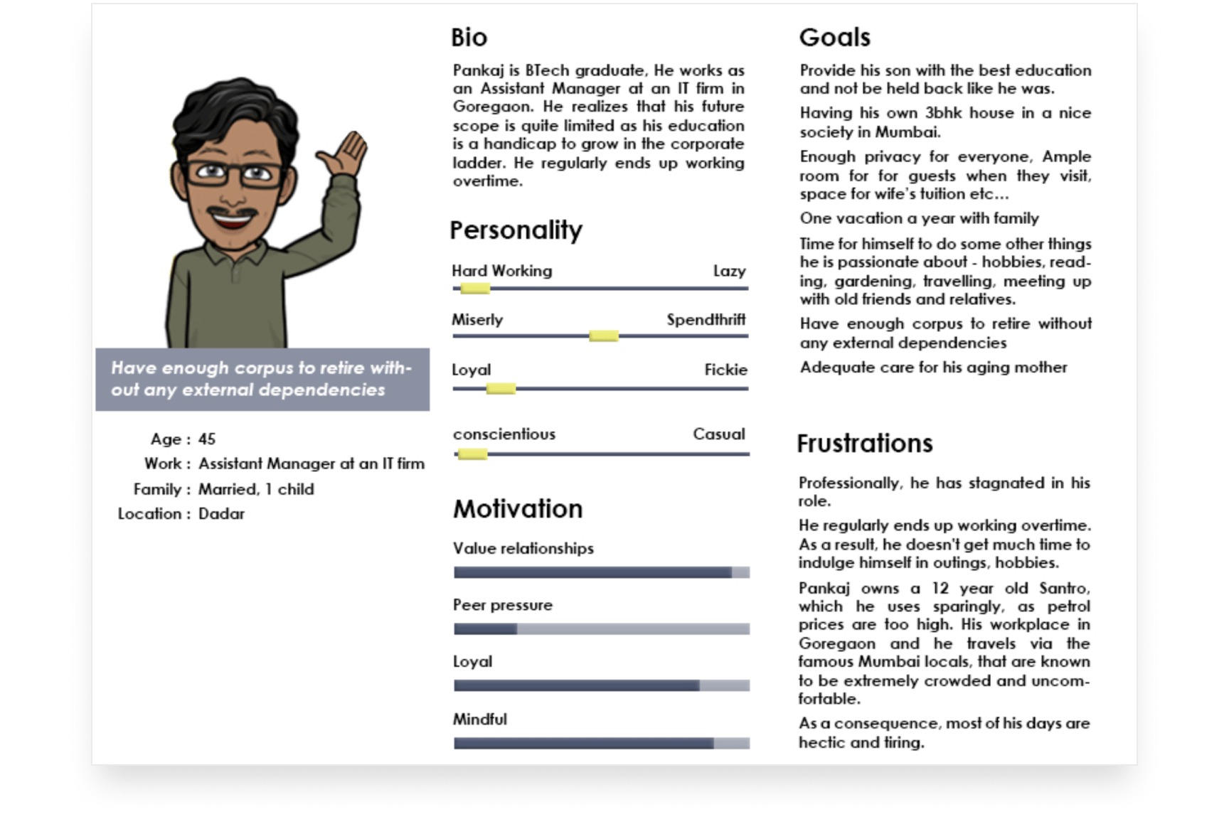
We defined personae from our contextual inquiry and affinity map, keeping major breakdowns, insights, and demographics in mind; as a model of reference for us to define our User Experience Goals.
Primary Product Goals

Seamlessly automate (or add) to track and manage all expenses systematically.

Minimize the cognitive load to save and manage money to achieve future goals.

Help families kick-start their journey toward personal financing.
User Experience Goals

Face minimal friction while keeping track of all expenses.

Derive meaningful data from financials to make prudent decisions.

A feeling of trust and security while sharing their details.

People should not feel held back because of education or regional/language restrictions.
User Case Scenarios
Based on our robust research, we developed various user goals. To depict what we were trying to solve, we created a short video to summarise them and create solutions.
I played the role of Milk Man in this video
Design Solution
To get higher-level design ideas out quickly without worrying much about the implementation, I created several sketches of the game, keeping the research insights in my mind, and filtered the best three. Following are some of the ideas.
SCENARIO-1
Tracking Online Payment
You made an online payment at a restaurant. You want to remember this payment to keep an eye on the monthly expense on food.
Users can make online payments by scanning the QR code. After the successful payment, the amount paid will be added automatically to monthly expenses.
SCENARIO-2
Tracking Offline Payment
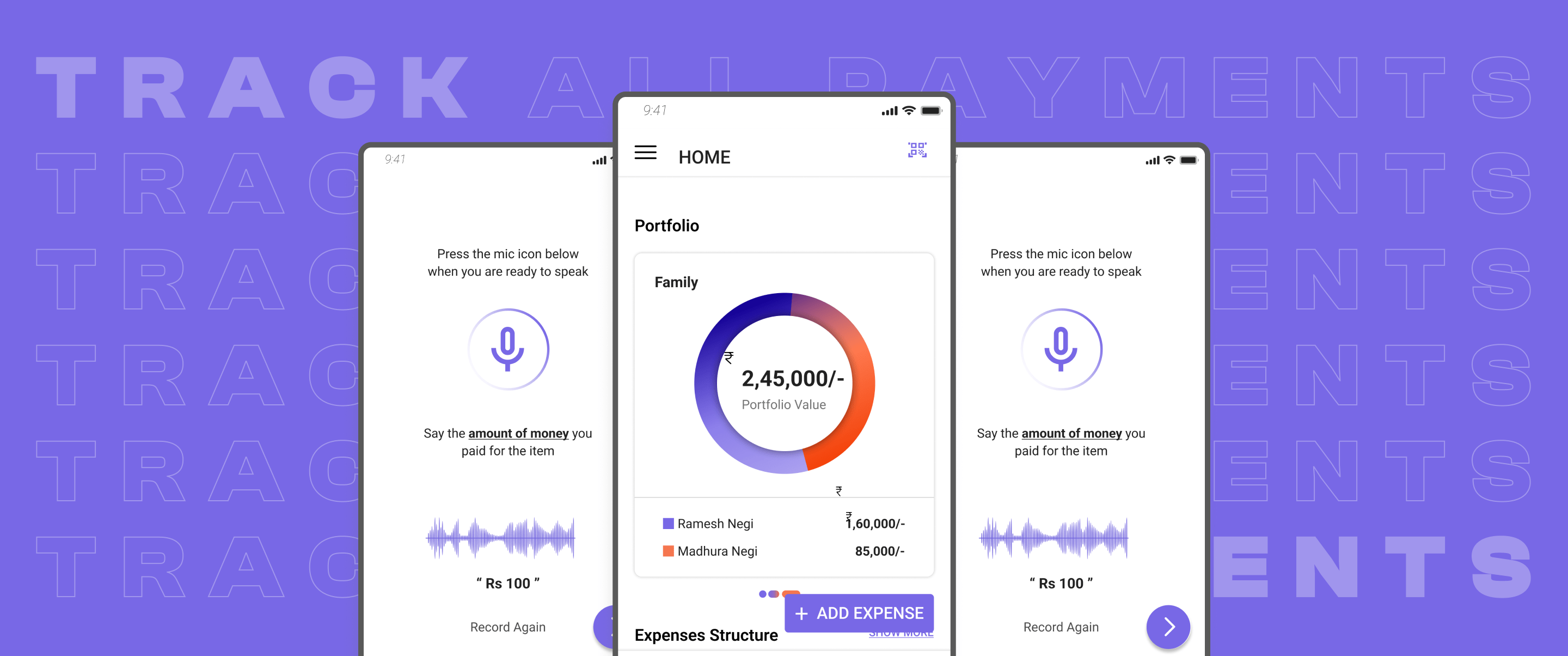
You are going to a dairy shop. Since the store didn’t have an online transaction facility, you paid Rs 100 via cash to the dairy.
Users can track offline payments by either manually entering the value or recording the voice message, which would automatically fill in the entries. To adopt the process of entering data via voice message, the app educates the user about what message to say while recording.
SCENARIO-3
Tracking Recurring Expenses
You buy a fixed amount of milk daily. You want to track the amount paid to the milkman to pay the correct amount to the milkman at the end of the month.
Users can track recurring payments by creating a schedule. If enabled, which is the default, the app sends a notification to users to check whether they have made the regular payment. For example: whether they have collected the milk today or not. By just pressing "Yes," it would automatically enter the data. The time of push notification will be decided based on past regular payment's time of entering the data. If collected earlier, they can hit the "Confirm" button to record today's collection.
SCENARIO-4
Setting Goal
You want to save money for your family trip planned six months from now.
Users can create a goal in the app. They can set the amount they want to save and the duration to achieve the goal. The frequency of notifications notifies them to save a particular amount or transfer to a savings account based on the frequency. This guides them to achieve their goal systematically.
Evaluation
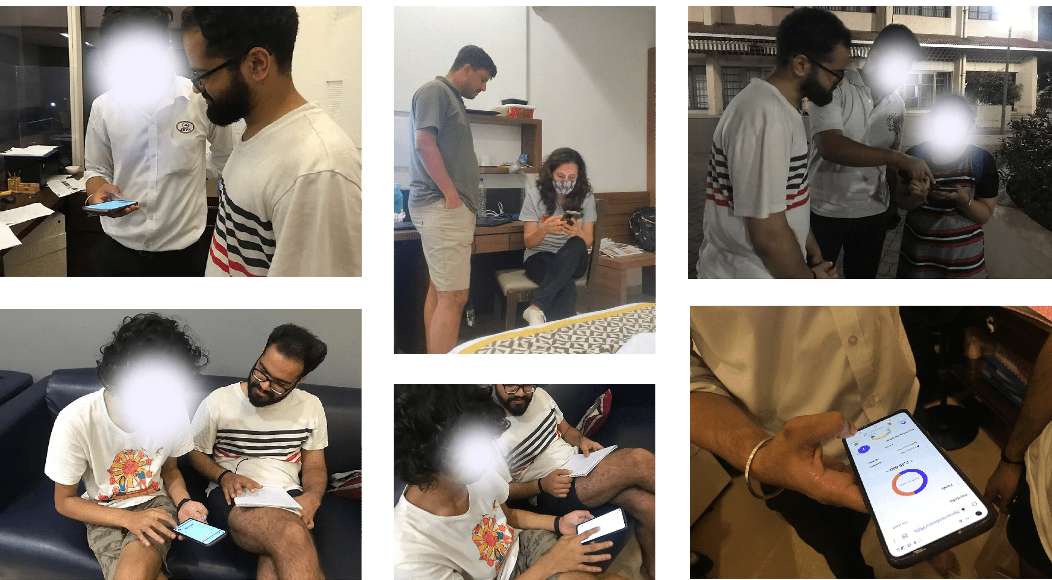
Due to time constraints, we conducted usability testing with five users and heuristic evaluation with two of our peers to evaluate whether our designs aligned with the goals.
Here's a brief overview of the process:
1
Explain the concept behind the app to the users.
2
Ask them to perform six benchmark tasks one by one.
3
Prompt them to think aloud while performing tasks.
4
Analyze testing findings to find patterns within the data.
5
Iterate designs based on new insights.

Some of the snaps of usability testing
