Background
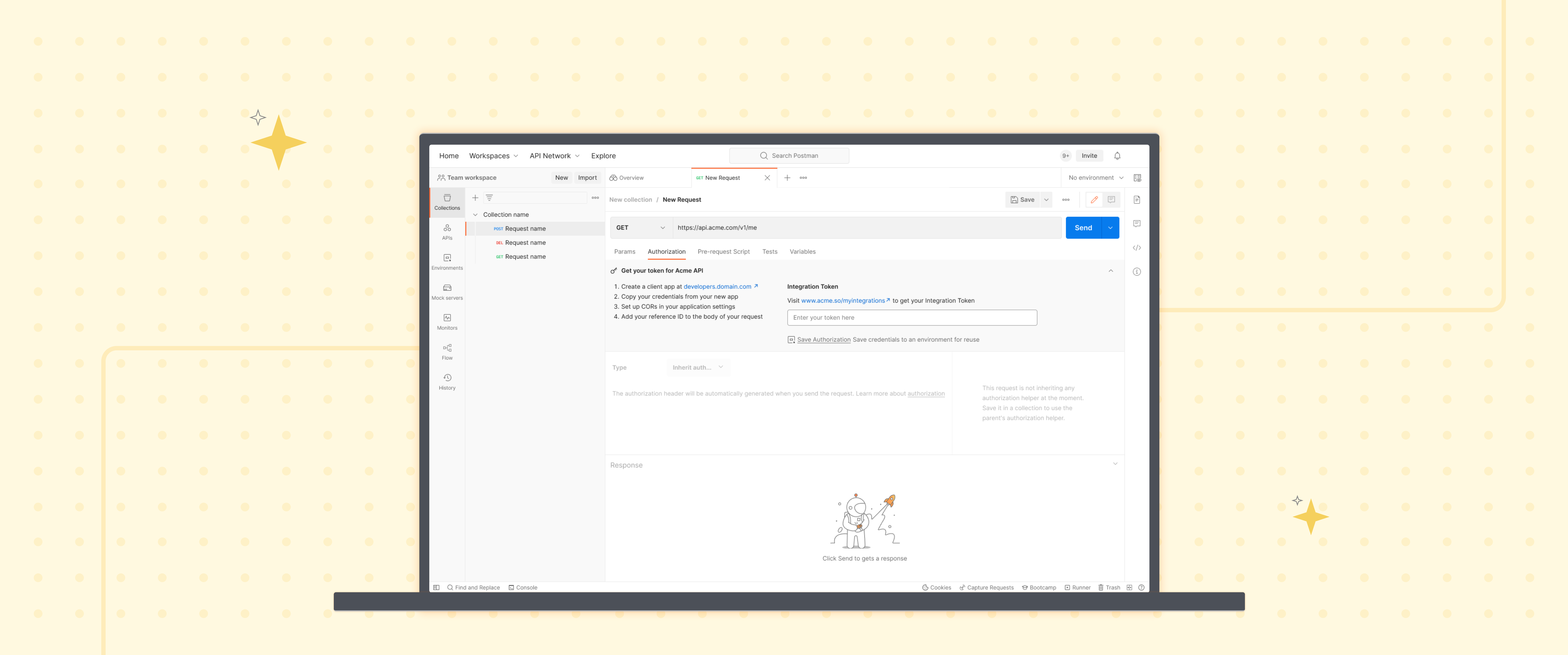
At Postman, I primarily worked as a Product Designer but also took on User Research responsibilities at various stages of this project. My goal was to design the MVP for a new assistive authorization and authentication experience, making the process smoother for developers. In this case study, I’ll highlight how my user research contributed to the project’s success.
Problem Context
One of the key steps in sending a successful API request is authentication and authorization, which varies depending on the type of request. However, developers frequently struggle with this step.

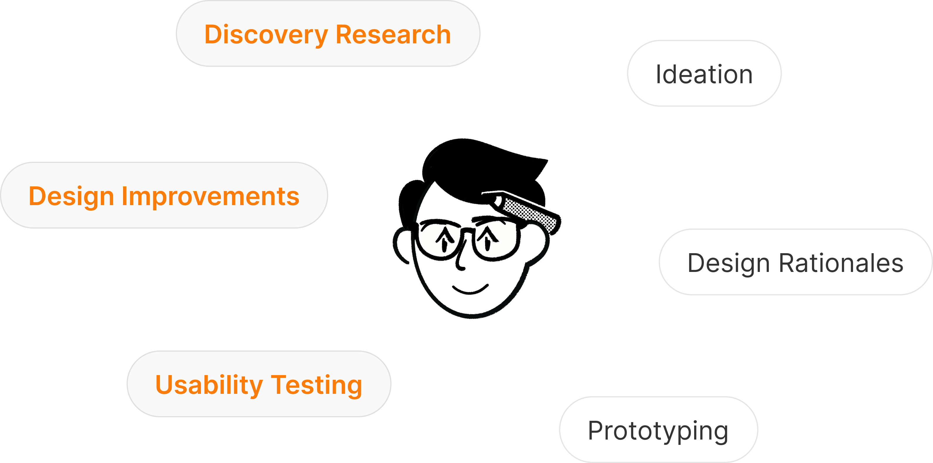
Discovery Research
Given the constraints of time and budget, conducting user interviews with Postman’s end users wasn’t feasible. Recruiting participants and scheduling interviews would have delayed the process. However, identifying pain points was crucial to defining what this MVP should address.
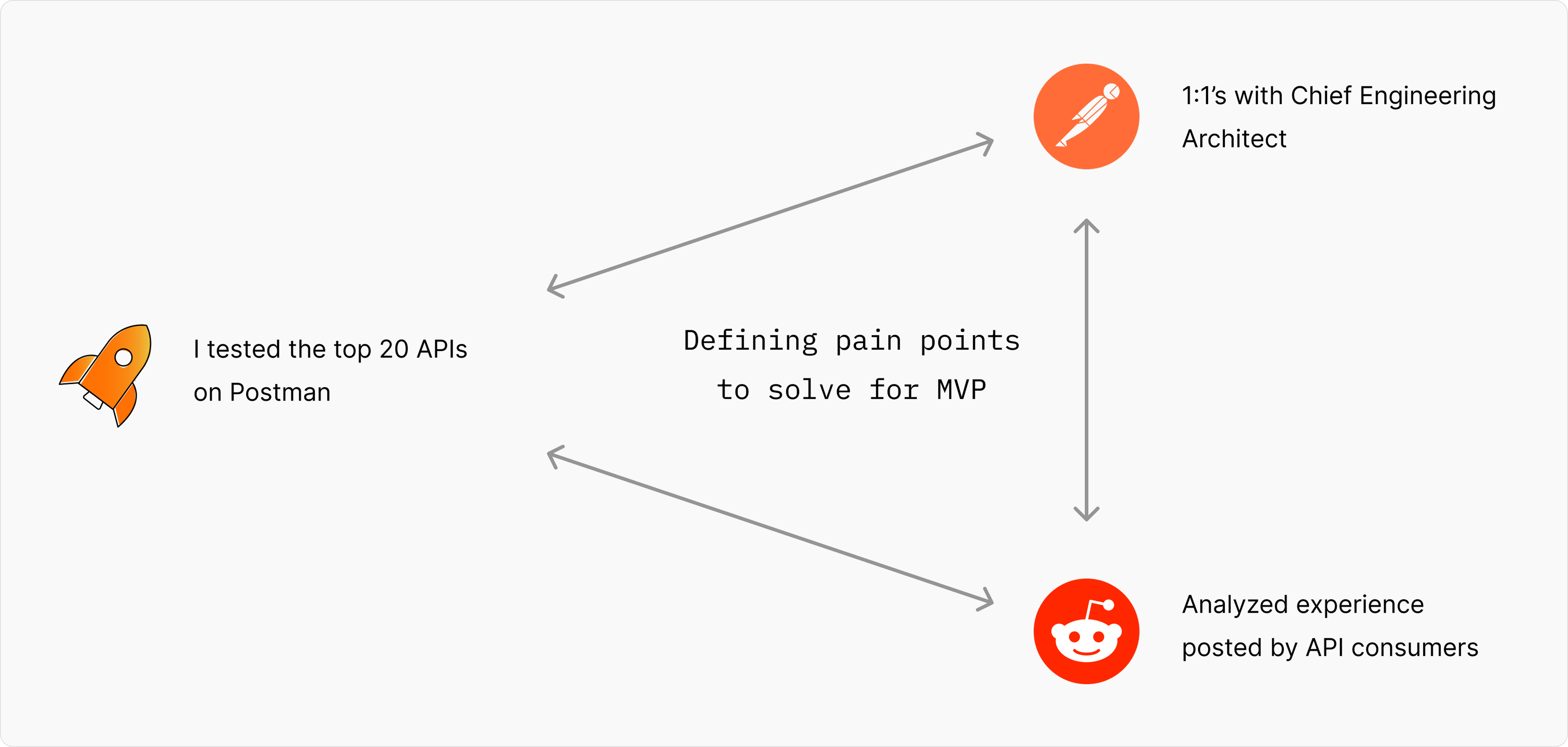
To gain firsthand insights, I tested the top 20 APIs on Postman, focusing specifically on the authorization and authentication experience. To further validate my observations, I analyzed qualitative content from Reddit discussions, where developers shared their struggles with API authentication.
Additionally, I conducted 1:1 sessions with the Chief Engineering Architect to discuss and refine the identified pain points. Through this triangulation of data, we defined the core problems that needed to be solved in the MVP.
Final Problem
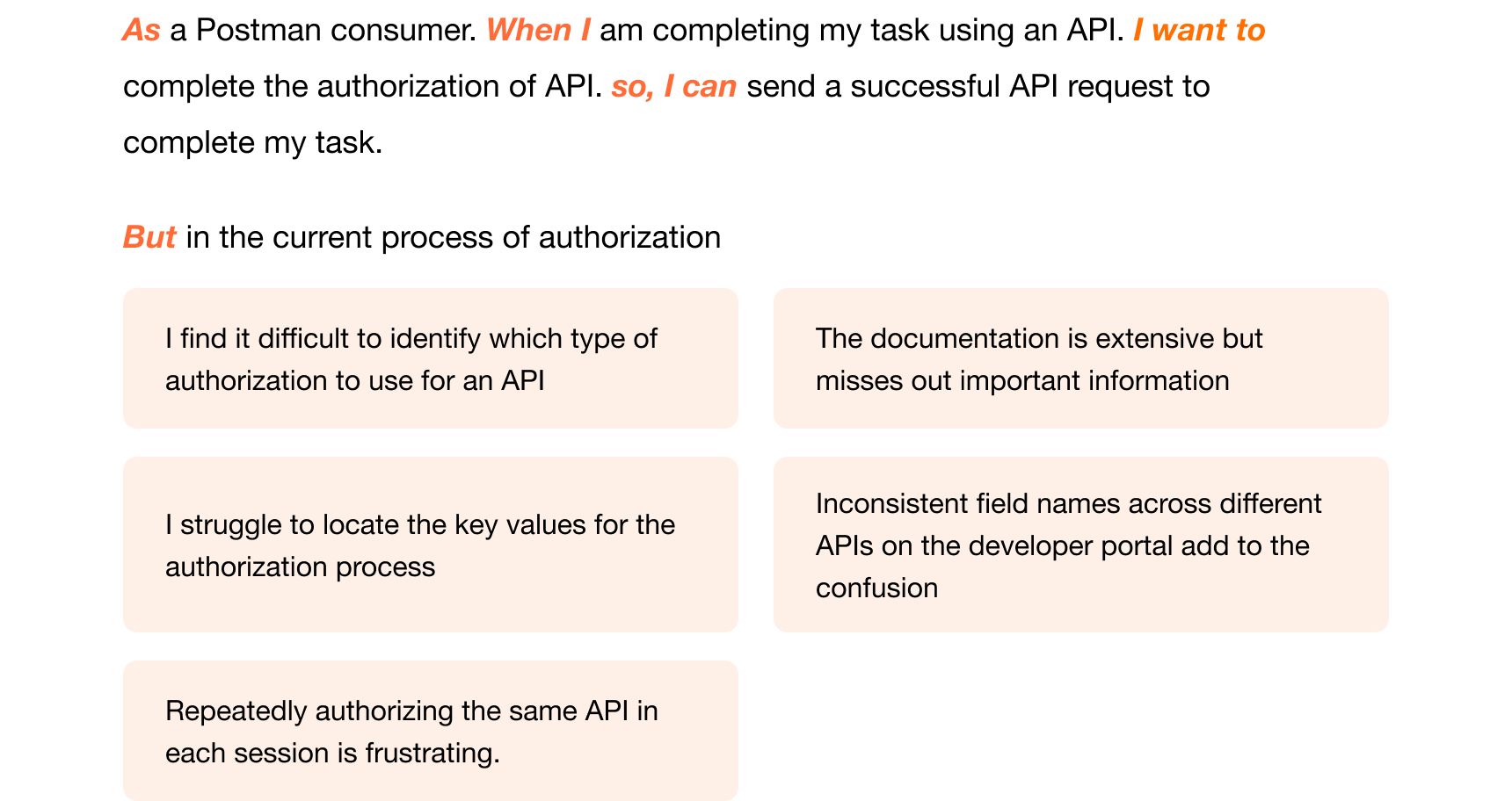
This process helped me refine the problem statement, which I then structured using the Jobs-To-Be-Done (JTBD) framework to ensure clarity, user-centered focus, and business alignment. It also helped in bringing all stakeholders onto the same page.
Proposed System
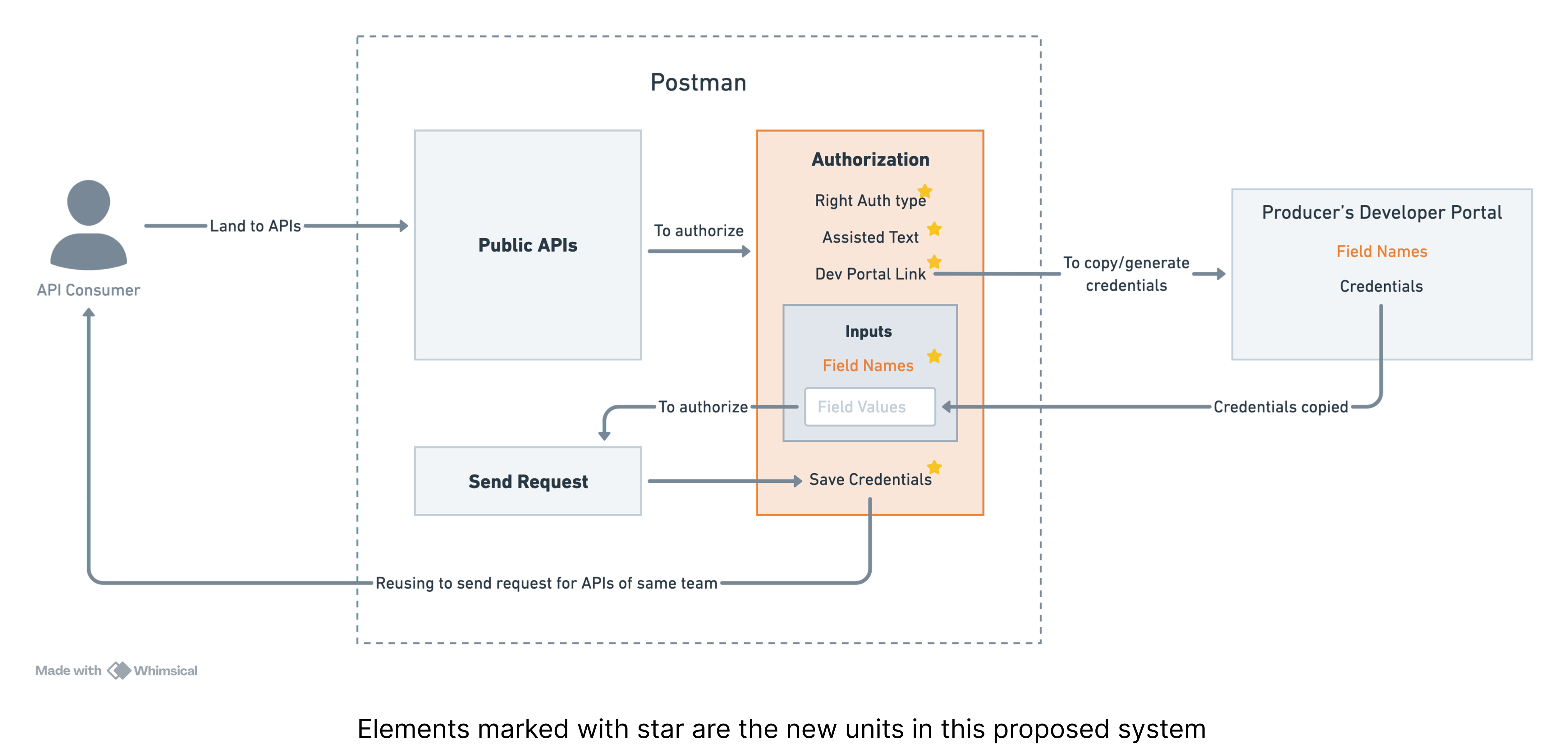
Before diving into design, it was essential to define how the proposed system should function. Drawing inspiration from 'Thinking in System's' by Donella Meadows, I collaborated with the Chief Engineering Architect to craft an initial framework. Feedback from stakeholders helped iteratively refine this foundation before starting the design process.
Proposed Design
After establishing a solid foundation, I transitioned back into my role as a designer to craft intuitive interaction flows. Through iterative refinement, guided by continuous feedback and reflection, I honed the designs to directly address user pain points and business needs. Below is the design used for usability testing.
Usability Testing
With no dedicated research team, I again took on the researcher role. During the design phase, I formed two hypotheses that shaped my decisions:

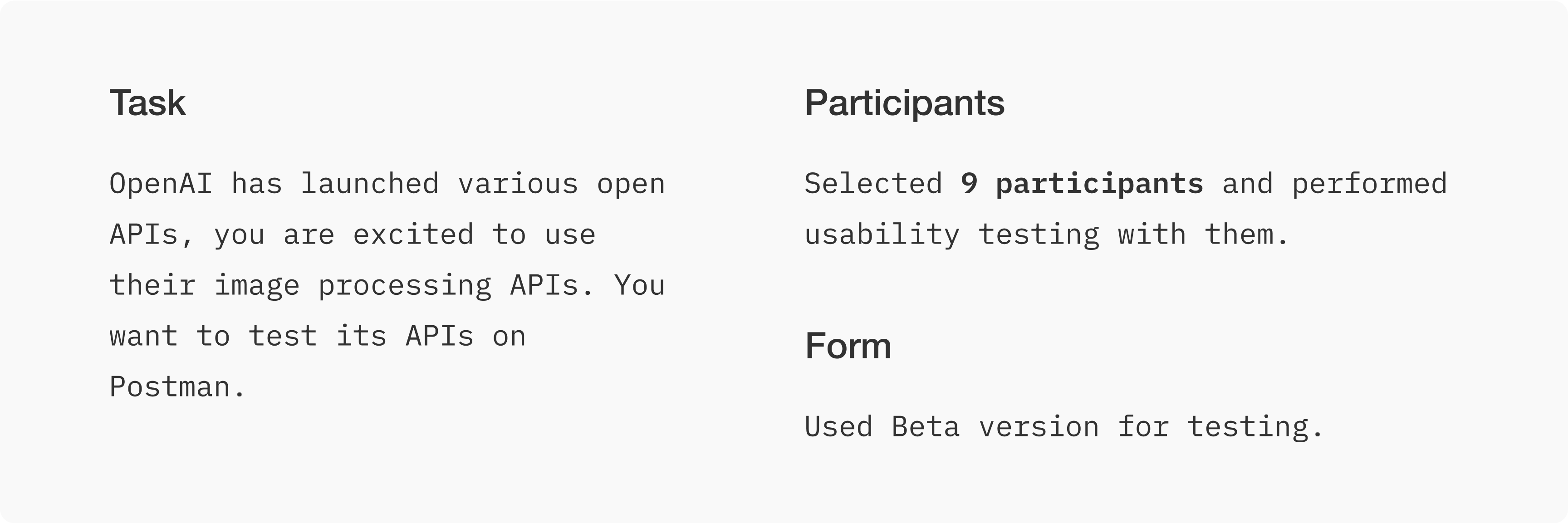
Due to budget and time constraints, recruiting end users was not feasible. Instead, I tested the feature with Postman employees who were developers and closely aligned with our target audience but had no prior exposure to the new system. This allowed me to validate the hypotheses effectively and identify areas for improvement.
Findings and Design Improvements
Issue 1: Users using shortcut key ignored the Contextual Nudge

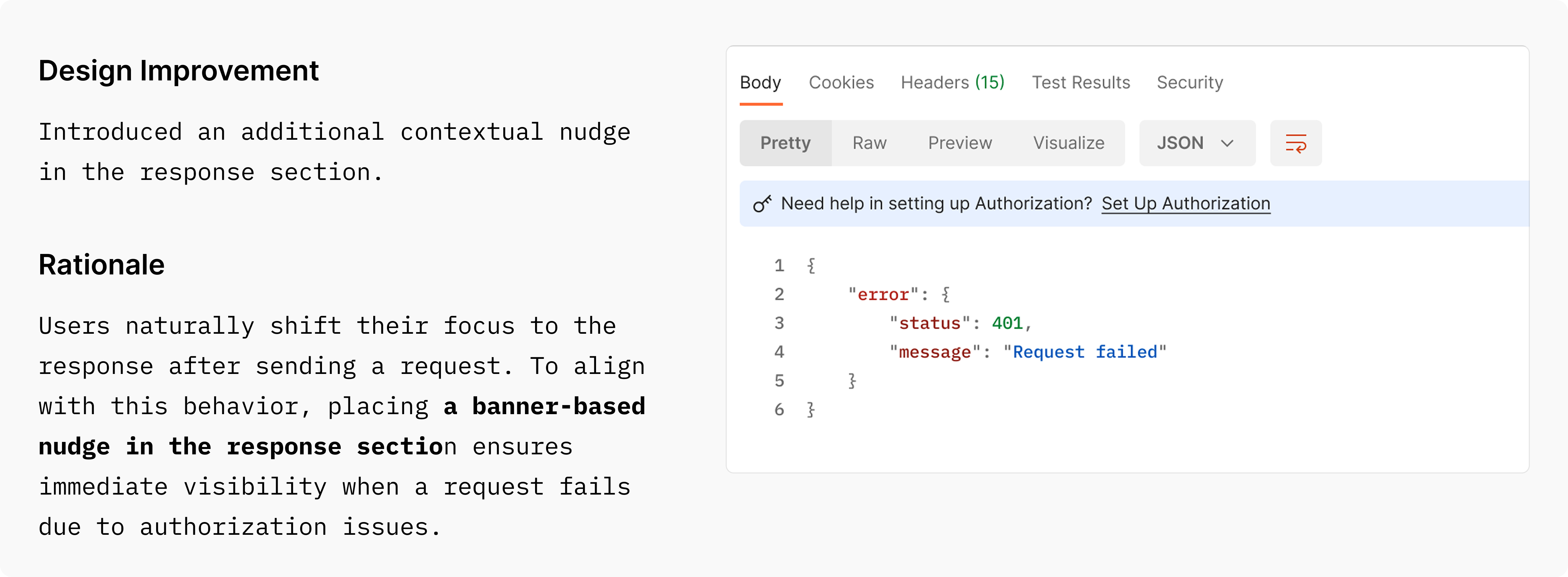
Issue 2: Users using shortcut key ignored the Contextual Nudge


Impact
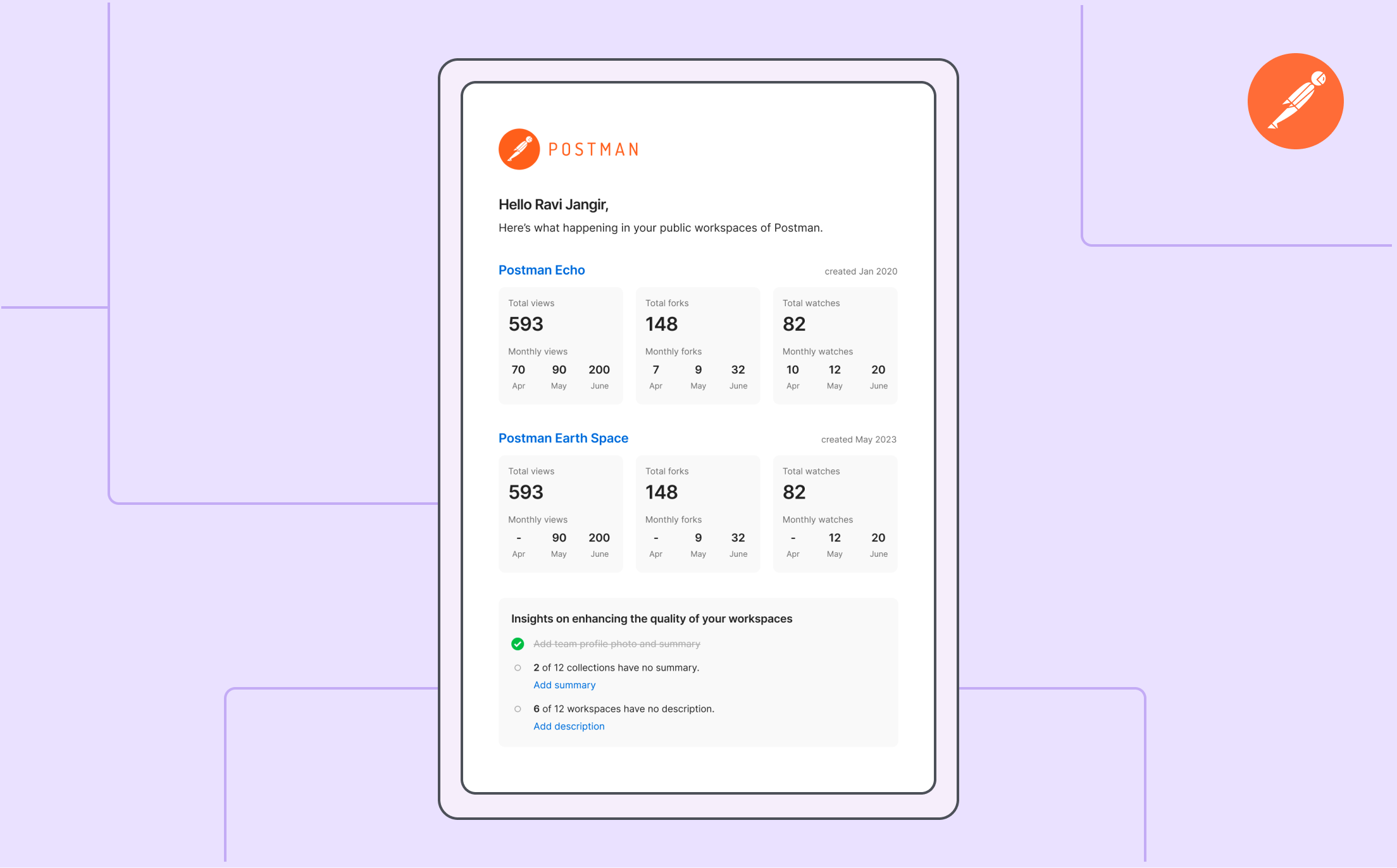
We received positive feedback from the producers on how these summary emails are beneficial for them to understand and measure their consumer’s interaction with their APIs.

Reflections
